The WES color palette and fonts are critical components to the foundation of new branding. The resources below, along with the information in the main brand guidelines, illustrate the proper use for color and typography throughout the system. Consistency throughout applications is key.
Primary Colors
These colors represent the WES brand on digital platforms. This hierarchy shows their order of use. Use these colors generously for type, backgrounds and pattern.
Color space is RGB – do not convert these colors to CMYK. Use colors for print.
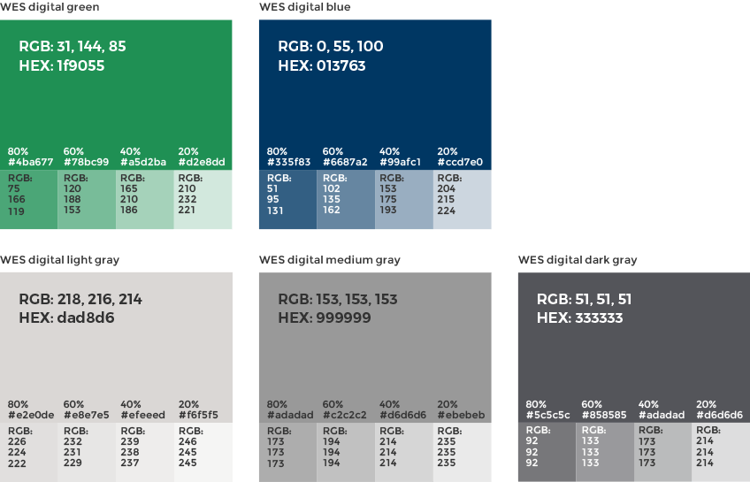
Tints are used to add visual contrast in charts, graphs and tables. These are created by using a percentage of the primary HEX/RGB colors.

Primary Colors
These colors represent the WES brand in print. This hierarchy shows their order of use. Use these colors generously for our type, backgrounds and pattern.
Color space is CMYK, do not convert these colors to RGB. Use colors for web and digital.
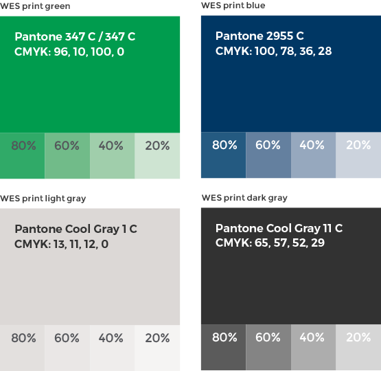
The use of tints of the primar y color palette provides color variation and design flexibility for all WES brand materials. Tints are used to add visual contrast in charts, graphs and tables. These are created by using a percentage of the primary Pantone/CMYK colors.

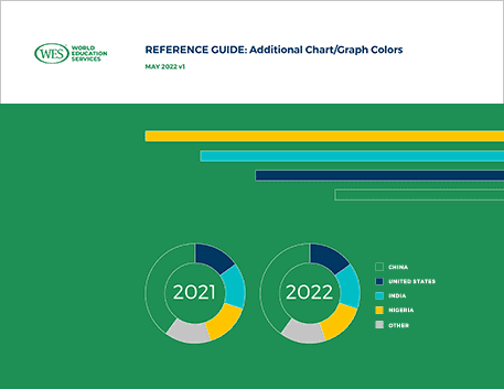
For better differentiation and clarity within WES research graphs (including pie, bar, line, etc.) and charts along with their legends, four colors have been added to complement the WES digital and print palettes. These additional colors are not part of WES’ main color palette and should be reserved for chart/graphic usage only.
Download the main brand guidelines here.
The primary fonts for the WES brand are Montserrat and Source Sans Pro. These fonts should be applied to both web and print applications whenever possible.
Montserrat
Characterized by rounder and wider letterforms, use Montserrat primarily for headlines.
Source Sans Pro
Characterized by narrower, more readable letterforms, use Source Sans Pro primarily for body copy.
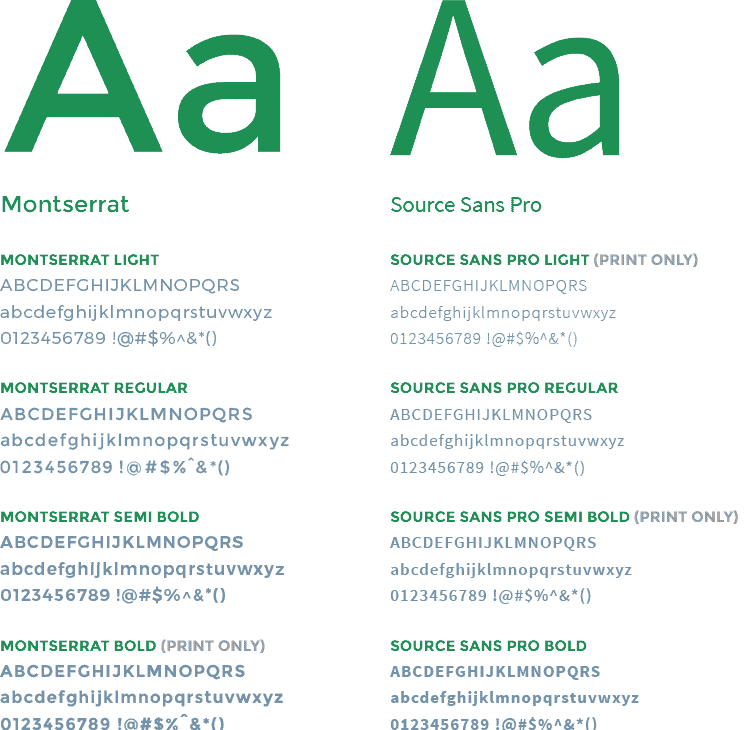
Download the font weights for the WES brand below. For the complete Montserrat and Source Sans Pro font families, please visit Google Fonts.
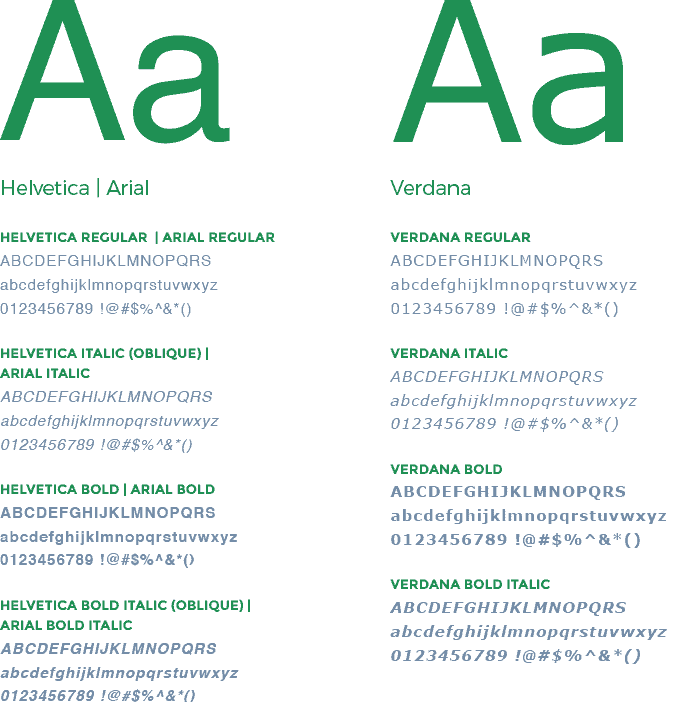
If either Montserrat or Source Sans Pro is not available, use Helvetica | Arial and Verdana as their substitute:
When in doubt, use Helvetica and Verdana. If Helvetica is not available, use Arial.
Helvetica | Arial
Use for headlines.
Verdana
Use for body copy.
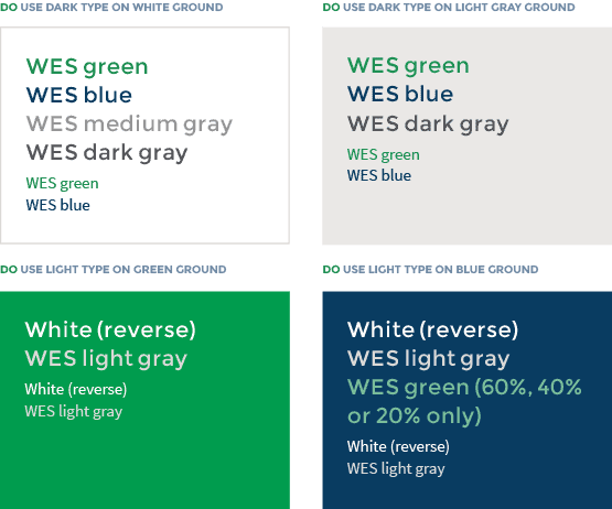
The following examples represent acceptable combinations of type on color for digital or print applications. They produce good contrast with clear readability.
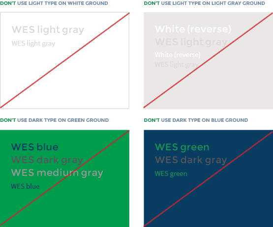
The following examples represent incorrect combinations of type on color in digital or print applications. They display low contrast with compromised readability.